Visual analytics can be a powerful tool for sharing research outcomes and ideas with diverse audiences, knowledge mobilization being one of the main objectives of MC3 2.0. They illustrate qualitative and quantitative information in graphics and figures that communicate complex patterns, relationships, and contexts between scientific concepts and theoretical frameworks. Adding a spatial dimension to the presentation of data enables a richer understanding of concepts, ideas and theories by engaging our visual pattern recognition and spatial reasoning abilities (Risch, Kao, Poteet & Wu 2008). In addition, visuals reduce the complex cognitive requirements for processing information and enhance our ability for synthesizing data and gaining insights on its meaning and / or implications (Keim, Mansmann, Schneidewind, Thomas, & Ziegler, 2008).
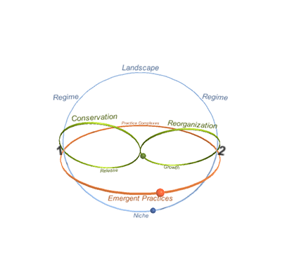
This interactive model serves as a step toward better understanding changes in development paths. It does this by exploring change through three theoretical lenses - multi-level perspective (MLP), social practice theory (SPT), and social-ecological systems (SES). It then integrates these perspectives to illustrate how each theory complements one another and ultimately provides a more comprehensive picture of how different forms of change occur.
Emerging MC3 Data (Phase 2)
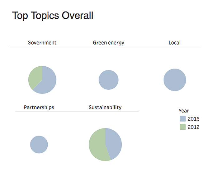
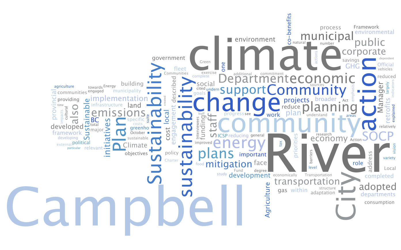
This interactive visualization depicts the top topics between the first phase of MC3: Meeting the Climate Change Challenge case study interviews and the second phase, when we re-interviewed a sub-sample from the original interviewees. To read more about this methodology of "text mining", see our recent write-up here.
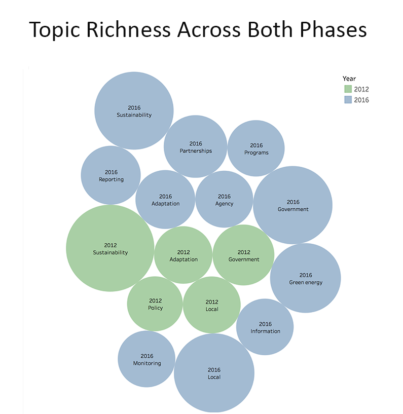
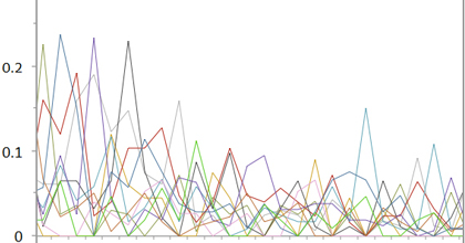
The above interactive visualization represents topic richness across both phases of the MC3 research. Topic richness measures the diversity of topics in each phase; the more topics that are discussed, the richer that phase is. This visualization has filtered the data so as to show only the top 0.5% of topics in each phase.
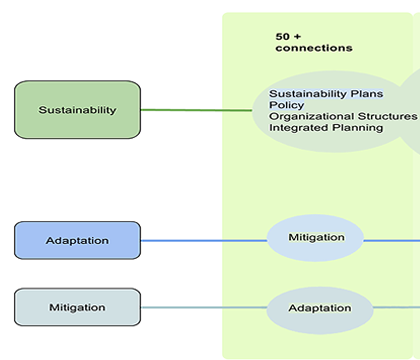
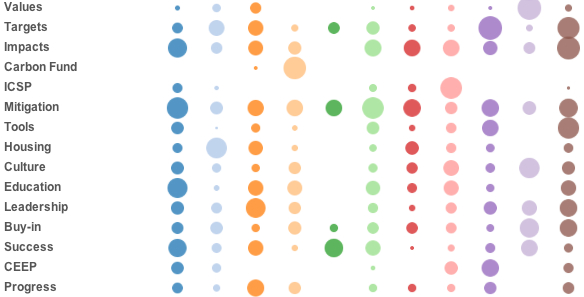
Using all interview data from the MC3 project, the tree map above shows the connections that stem from three main topics: 'sustainability', 'adaptation', and 'mitigation'. A connection between two topics is here determined by sharing a context of ten words. Click for more details.
A Picture of Electrical Energy Use in Canada

MC3 Meta-analysis Visualizations
These visualizations represents the outcomes of a meta-analysis on MC3 case study data, conducted to elucidate common drivers and barriers to community climate action.
Keim, D. A., Mansmann, F., Schneidewind, J., Thomas, J., & Ziegler, H. (2008). Visual analytics: Scope and challenges (pp. 76-90). Springer Berlin Heidelberg.
Risch, J., Kao, A., Poteet, S. R., & Wu, Y. J. J. (2008). Text visualization for visual text analytics. In Visual Data Mining (pp. 154-171). Springer Berlin Heidelberg.